
GPT Image 2 Anime Key Visual Generator
A practical generator for anime key visuals that hold a place together — built and tested on A Silent Voice, with four published works and an honest comparison against Krea 2.
GPT Image 2 Anime Key Visual Generator
This is a working generator page for one job: turn an anime world into key visuals that hold a scene together — two people on a bridge, a classroom after everyone has left, a notebook that carries more meaning than any character is willing to say. GPT Image 2 is the detail-first option: slower and more expensive than the fast graphic models, but unusually good at building a place with readable depth.
Everything below was made inside A Silent Voice, a playable world with 27 materials. It contains four published key visuals: two prompts, each run unchanged on GPT Image 2 and Krea 2. The prompt skeleton, the settings and the repair clauses are the ones actually used, not a cleaned-up version written after the fact.
What GPT Image 2 does better here
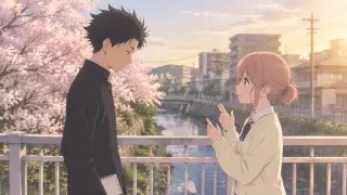
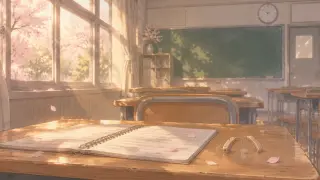
Anime key art usually fails in one of two ways: it is beautiful but geographically impossible, or it is geographically correct and completely dead. GPT Image 2 leans toward the first problem less often than you would expect. It separates a scene into planes — foreground object, figures, middle ground, background — and keeps them consistent. On the bridge, that means the railing stays in front, the river recedes under it, and the town sits behind at a believable distance. On the empty classroom, it means the notebook is on the desk rather than floating above it, and the rows of desks actually recede.
- Spatial depthBuilds foreground, subject and background as separate planes. You can point to where the river is, where the railing sits and which way the town runs. That makes the image reusable as a background plate.
- Small props that surviveA hearing aid, a spiral binding, a clock face, a petal on a page. GPT Image 2 tends to keep these legible instead of melting them into texture, which matters when a prop is carrying the story.
- Controlled lightHandles low-contrast late-afternoon light without flattening the whole frame. The shadows stay soft, the window stays bright, and the figures remain readable against both.
A prompt skeleton that survives
The prompts that work are not poetry. They are a shot list with a mood clause at the end. Build them in a fixed order so you can debug one layer at a time: format, place, figures, obstruction, light, style, exclusions. If the image comes back wrong, you know which clause to change.
Format
“Anime key visual, cinematic 16:9.” Set the aspect and the job before anything else. Do not ask for a poster if you need a background plate.
Place
Name the location and the time of day in one sentence: “a narrow pedestrian bridge over a shallow river in a Japanese town, late afternoon.”
Figures
Give each character one silhouette fact and one emotional fact: age, hair, uniform, posture, where they are looking. Do not write a biography.
Obstruction
Put an object between them or in their hands: a railing, a notebook, a camera, a bag. The object gives the hands something to do and the scene a physical stake.
Light
Choose one key and one fill. “Warm low sun and long soft shadows” is enough. Avoid three light sources unless the scene is about confusion.
Style lock
Repeat the same style sentence every time: line quality, colour transparency, contrast level, shadow behaviour. This is what keeps a series consistent.
Exclusions
End with the things you do not want: no text, no letters, no signage, no watermark, no logo. Anime models love to invent school signage and title cards.
The bridge prompt, annotated
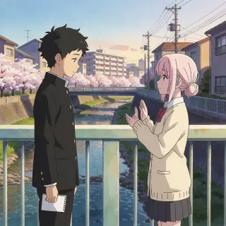
The bridge image is a two-shot with a built environment. The prompt names Shōya and Shōko, gives each one a silhouette fact (messy black hair and a dark uniform; pale pink hair in a low bun and a cream cardigan), and then gives them a shared object: the notebook. It places a hearing aid behind Shōko’s ear, because the story is about communication and the prop should be visible without becoming a label. It asks for the railing to catch the light, which turns the bridge into a horizontal line across the frame.
The prompt does not say “sad” or “romantic”. It says “warm low sun and long soft shadows” and lets the staging do the emotional work. That is the difference between a key visual and an illustration of an adjective.
The result is deliberately not a confession scene. The figures are turned toward each other but not touching; Shōko’s hands are half-raised, which could be the start of a sign or the end of one. The notebook is closed in Shōya’s hand. Every element is a question the next scene can answer.
Why the empty classroom is the harder test
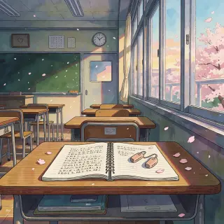
Remove the faces and the model has nothing to hide behind. The second prompt is a still life: an open notebook, a pair of hearing aids, cherry petals, empty desks, a clock and a green blackboard. It has to communicate absence without a single character. GPT Image 2 handles it by treating the room as a set of receding planes and letting the desk in the foreground carry the focus. The notebook’s ruled pages, the curve of the hearing aids and the dust in the light are all rendered as objects with weight.
Krea 2 on the same prompt produces a bolder, flatter image: the window becomes a poster shape, the sunset is more saturated, and the notebook and hearing aids read instantly at small size. It is a better thumbnail. GPT Image 2 is a better memory. Knowing which one you need is most of the decision.
GPT Image 2 vs Krea 2 on identical prompts
- Choose GPT Image 2 whenThe scene needs depth, reusable geography, several small props, or a quiet emotional beat that depends on where people are standing. Budget for a slower render and a higher cost per image.
- Choose Krea 2 whenYou need speed, volume, a strong silhouette or a thumbnail-first look. It is roughly a quarter of the cost per image and much faster, but it is text-only input and known to struggle with legible text.
The honest comparison is not “which model is better.” It is “which failure can this scene survive?” GPT Image 2 can over-render and become fussy; Krea 2 can flatten a scene into a poster when you needed a room. Run both on the first prompt of a series, pick the one whose weaknesses you can repair, then stop comparing and build the set.
Settings that matter
- Size Use 2048×1152 for a 16:9 key visual. If the image will sit behind a title, leave the upper third quiet and say so in the prompt.
- Quality High is worth it for a hero image with small props. For exploration, generate a cheaper pass first and only re-run the chosen composition at high quality.
- Aspect Krea 2 returned a square image on the same brief. If a 16:9 plate is non-negotiable, check the output before you build the rest of the series around it.
- Reference images GPT Image 2 accepts reference images; Krea 2 is text-only. Use a reference when a character’s face or a location’s layout has to stay consistent across scenes.
- Iteration Change one clause at a time. If you rewrite the whole prompt after a bad render, you learn nothing about which word caused the problem.
Five failure modes and their fixes
- The scene becomes a poster Add a foreground object and a second plane. “Railing in the immediate foreground, river behind it, town behind that” forces depth.
- The faces drift off-model Reduce the number of characters in frame and describe one silhouette fact per person. Two figures with clear hair shapes beat five with detailed biographies.
- The hands disappear or fuse Give the hands a job: holding a notebook, resting on a railing, half-raised in a sign. Empty hands are where anime models improvise badly.
- The model invents signage Add “no text, no letters, no signage, no watermark, no logo” to the exclusion clause. Then check the blackboard and the poster on the wall.
- The light is beautiful but the story is gone Remove one light source and name the emotional obstruction. If the image is still about the sunset, the prompt was about the sunset.
Negative prompts and exclusions
Use exclusions for the things that break a series, not for everything you dislike. Text, watermarks, logos and UI are the reliable four. Add “no extra fingers” only if hands are visible and central; otherwise it wastes prompt space. Add “no modern signage” when the town should feel like a specific Japanese town rather than a generic anime city. Keep the exclusion list short and stable so you can compare runs.
From one image to a world
Write the card first
Decide who is in the scene, what they want and what they will not say. The prompt is a translation of that card, not a substitute for it.
Generate the geography
Run the location with no characters or distant figures. Check the planes, the light and the reusable background plate.
Add the figures
Put the characters into the approved geography. Keep the style clause identical or the series will drift.
Publish the pair
Share the GPT Image 2 and Krea 2 versions together. The comparison is useful to readers and keeps you honest about what each model is doing.
What this generator is not
It is not a character-consistency machine. GPT Image 2 can hold a look across a few images, especially with references, but it will not guarantee the same face across a twenty-scene visual novel. It is not a typesetting tool; if the image needs a title, add the title in the layout, not in the prompt. And it is not a substitute for staging. A prompt full of mood words and no blocking will produce a beautiful postcard of nothing.
Cost, speed and when to use the cheaper model
GPT Image 2 sits at the higher end of the image budget and is relatively slow. That is fine for a hero image or a background plate you will reuse, and wasteful for a contact sheet of ten ideas. The practical workflow is to explore with Krea 2, choose the composition, then rebuild the chosen frame in GPT Image 2 with the same skeleton and a tighter style lock. You get the speed of one model and the depth of the other.
Questions about this generator
- Do I need a reference image? No for the first image. Yes if a character’s face or a location’s layout has to stay identical across a series. GPT Image 2 accepts references; Krea 2 does not.
- Why does my anime image look like a photograph? Your style clause is too weak. Name the line quality, the transparent colour and the low-contrast shadow behaviour explicitly, and repeat the same sentence every run.
- Can I generate text in the image? Avoid it. Both models are unreliable with legible text, and Krea 2 is a known weak case. Add the title in the page layout instead.
- How many images should a world have? Four is enough to prove a look: two prompts, two models. Add more only when a scene needs a new angle or a new character.
Generate your first anime key visual
The bridge and the empty classroom are already published in two models. Open the world, copy the prompt skeleton and make the next frame yours.