
Krea 2 Cyberpunk Key Visual Generator
A shape-first generator for neon cities, trench-coat silhouettes and rain-soaked rooftops — fast, cheap and built to read at thumbnail size.
Krea 2 Cyberpunk Key Visual Generator
This is a working generator page for one job: turn a cyberpunk world into key visuals that read instantly — a city you recognise from the silhouette, a figure you understand from the coat, a rooftop beat you feel before you parse it. Krea 2 is the shape-first option: fast, cheap, graphic, and unusually good at compressing a scene into two or three values.
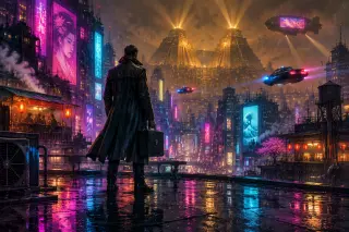
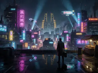
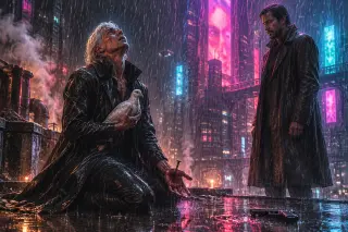
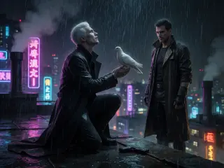
Everything below was made inside Blade Runner: The Empathy Test, a playable world with 27 materials. It contains four published key visuals: two prompts, each run unchanged on Krea 2 and GPT Image 2. The settings, the prompt skeleton and the repair clauses are the ones actually used.
What Krea 2 Does Best Here
- Silhouette and statusA trench coat, a briefcase, a small figure against a tall building. Krea 2 makes the relationship legible at a glance, which is the whole job of a cyberpunk establishing shot.
- Graphic neonIt produces clean magenta-cyan planes and readable signage shapes without turning the image into a noisy light show. The palette stays controlled even when the prompt asks for a whole street of signs.
- Speed and costAt roughly one cent per image, it is about five times cheaper than GPT Image 2 and much faster. That changes the workflow: you can run ten variations before you commit to a direction.
- Poster cropsThe results survive being reduced to a thumbnail, a social card or a title screen. Fewer props means fewer things to lose when the image is small.
The Exact Settings Used for These Works
| Model | krea2 |
| Input | Text only |
| Requested size | 1024 × 768, landscape |
| Returned size | 2048 × 1536, WebP |
| References | None |
| Retouching | None |
Why landscape: a cyberpunk city is a horizontal argument — figure, street, skyline — and a square crop collapses the three planes into a poster. Portrait works for a single character, but the model tends to fill the empty space with more neon rather than more person. Start landscape for places, portrait for people, and never change the aspect after you have written the composition.
A Prompt Skeleton for Cyberpunk Key Visuals
Nine clauses, in this order. Style first; the subject and the light do the rest.
[world] key visual, high-contrast neon digital painting, [aspect]: [figure + costume + prop]; [three depth planes]; [architecture and signage]; [weather]; [two named light sources]; [palette anchors]; [camera height]; no text, no logos, no watermark.
The clause most people skip is the three depth planes. A cyberpunk image dies when the city becomes a wall of lights. Name a foreground (wet roof, puddle, air conditioner), a middle ground (street, stall, crowd) and a background (tower, blimp, smog). Krea 2 will flatten them into bands, but it will flatten the right bands. The second most-skipped clause is camera height: a low camera makes the towers monstrous and the figure small, which is the entire emotional point.
Step by Step: The Los Angeles City Key Visual
Start from the world overview
A rain-drowned vertical city, two corporate ziggurats, a blade runner with a briefcase. The card is the brief; the film title is not.
Pick the argument
One person is small inside a city that was not built for people. That gives you a low camera, a distant figure and towers that leave the top of the frame.
Write three planes
Foreground rooftop with puddles and a briefcase; middle ground street canyon with stalls and spinners; background ziggurats, smog and a blimp.
Name two lights
Neon signage as the key, warm amber practicals as the fill. Add searchlights as vertical lines only if the sky feels empty.
Generate at 1024×768
Krea 2 returns a larger WebP, but the composition is decided at the requested frame. Check the silhouette first, the props second.
Run the same text on GPT Image 2
Do this before iterating. If both models miss the same clause, the prompt is wrong. If only Krea misses it, the model is wrong for the job.
Step by Step: The Tears in the Rain Rooftop
Reduce the beat to four facts
A dying replicant kneels. He holds a white dove. One hand is pierced by a nail. A blade runner watches, disarmed.
Place the gun
Put the pistol in a puddle between them. It explains the truce without a caption and gives the foreground a second focal point.
Keep the rain warm
Warm night rain against cold neon is the palette rule. Cold, clean rain turns the scene into a different genre.
Protect the face
Scarred, pale, exhausted, looking up — not peaceful. Krea 2 will try to beautify him; repeat “exhausted wonder, not serenity”.
Accept the simplification
The Krea version will stage the scene more symmetrically than GPT Image 2. That is not a failure; it is a poster. Use it for the cover and keep the GPT frame for the story.
Krea 2 vs GPT Image 2 on the Same Brief
Both models received identical text. On the city, Krea 2 returned a blue-black poster with two gold verticals, a bright blimp and a figure reduced to a silhouette. GPT Image 2 returned a lived-in street with a noodle stall, customers, laundry, an air-conditioning unit and wet reflections that separate colour by surface.
On the rooftop, Krea 2 produced a near-symmetrical two-shot with a clean dove and a graphic gun. GPT Image 2 kept the rain, the nail, the blood and the dove’s weight. The Krea frame reads faster; the GPT frame explains more. Neither is a retouch of the other.
- Use Krea 2 forCovers, thumbnails, social crops, title screens, and any frame that has to work at 300 pixels wide. It is also the right model for exploring ten directions before committing.
- Use GPT Image 2 forEstablishing shots, costume logic, props that must look usable, and scenes where the viewer has to understand who is standing where and why.
- Use both forA hero image and its poster cut. Write the brief once, run it twice, and let the comparison decide which one goes on the page.
- Do not use either forLegible text, captions, logos or UI. Krea 2 is explicitly weak at text; GPT Image 2 can render it but it will look designed rather than painted.
Where Krea 2 Drifts
It simplifies aggressively. A crowd becomes five silhouettes, a market becomes three signs, a costume becomes a coat. That is usually the point, but it can erase the detail that carries the story: a snake scale, a broken hand, a specific scar. When the scene depends on a small object, either move the object closer to the camera or switch to GPT Image 2 for that frame.
It also has a known weakness with text. Neon signage in the generated city reads as letter-like shapes rather than real characters. That is acceptable for atmosphere and unacceptable for a poster that needs a title. Keep all legible text in the layout, not in the image.
Prompt Repairs That Actually Work
What to Generate First
Start with the city. It is the cheapest test of whether the model understands the world: one figure, three planes, two light sources. If the silhouette reads and the towers feel tall, the model is holding the setting and you can move to the rooftop, which is much harder. If it fails, the failure will be specific — a wall of lights instead of planes, a figure that blends into the street — and you can repair the clause that caused it.
Questions About This Generator
Do the prompts require reference images?
No. Every key visual on this page was text to image. Krea 2 does not accept reference images. The world cards carry the consistency: costume, props, palette and light are written down, so you are not re-describing them from memory.
Can I use a different aspect ratio?
Yes, but change the composition with it. A 16:9 city needs a wider street or a second tower; a square rooftop needs the two figures pulled closer. Aspect is a composition decision, not an export setting.
Why does the returned image not match the requested size?
Krea 2 may return a larger WebP than the requested frame. Treat the requested size as the composition contract and the returned size as the export. Do not rewrite the prompt to chase pixels.
Is Krea 2 good enough for a hero image?
For a poster, yes. For a scene that has to explain a place, use GPT Image 2 and keep Krea 2 for the cover cut. The right question is not “is it good” but “what does this frame have to do”.
Generate a cyberpunk key visual
The brief is already written: 27 world cards, four published visuals, and a nine-clause skeleton that fits on one screen. Start with the city — or open the studio and pick a harder scene.
Blade Runner is an independent, fan-built world in Neta Studio and is not affiliated with Alcon Entertainment, Warner Bros. or the rights holders of the film. Every character, place, event, faction and rule here is an editable world material rather than canonical text. The four key visuals on this page were generated inside this world with GPT Image 2 and Krea 2 from two identical prompts. Open the studio to read every card.