The Best AI Anime Personality Poster Generator
Create MBTI-style anime personality posters — archetype art, traits chart.

Turn one sentence into a full personality poster
Describe a person, an OC, or a vibe — Neta Studio returns archetype art, a four-letter type code, and a readable traits chart on one poster.
What an AI anime personality poster actually is
A personality poster is a single image that does three jobs at once: it shows an anime archetype portrait, it names that archetype with a short type code, and it proves the claim with a small traits chart. Think of an MBTI result screen redrawn as key art. Instead of a plain four-letter label on a white background, you get a character who looks like the label — posture, palette, wardrobe, and lighting all arguing the same point. Neta Studio builds the portrait and the data layer together, so the bars, labels, and type code sit inside the composition instead of being pasted on afterward.
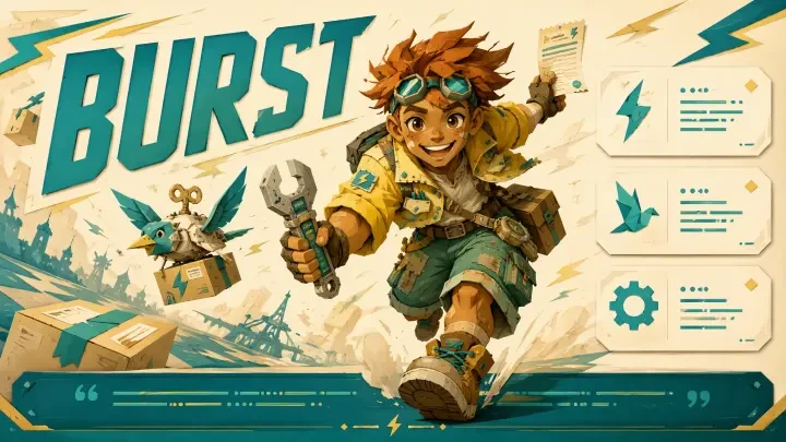
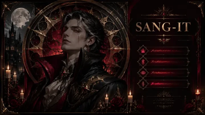
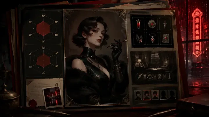
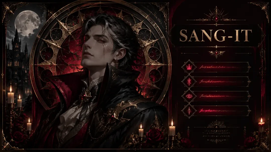
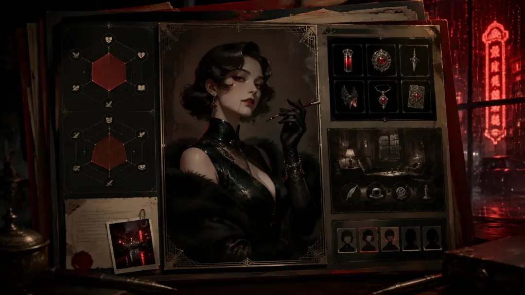
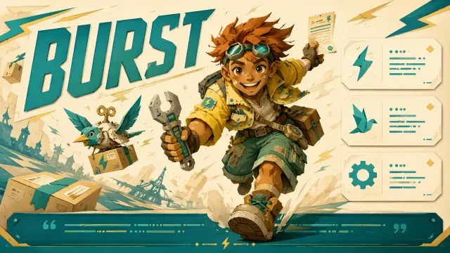
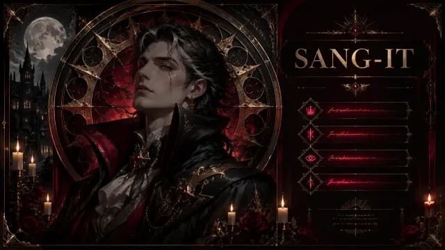
Look at the three featured works to see the range. "SBTI Personality Poster — The Spark Runner (BURST, The Live-Wire Courier)" is high-voltage: hot signal colors, a body caught mid-sprint, trait bars that read like a dashboard. "SBTI Personality Poster — Vampire Aristocrat (SANG-IT, The Eternal Observer)" is its opposite — still, patient, drenched in crimson and shadow, with a chart that scores restraint as a strength. "Character Profile Card — Nyx, the Vampire Detective of 1930s Shanghai" pushes the same system toward a dossier layout: profile card, case-file typography, stats as evidence. Same generator, three completely different design languages.
What you can make in a single session
- Archetype posters — one character, one four-letter type code, one tagline like "The Live-Wire Courier" or "The Eternal Observer".
- Traits charts — three to six labelled bars or radials that quantify the personality instead of just asserting it.
- Character profile cards — dossier layouts in the spirit of "Character Profile Card — Nyx, the Vampire Detective of 1930s Shanghai", with role, era, and case notes.
- Full type sets — sixteen posters that share a grid, a type-code system, and a palette family, so they read as one collection.
- Quiz result screens — the same poster resized for a share card, a story frame, or a wide banner.
- Group compatibility sheets — two or three archetypes on one board, matched or deliberately clashing.
Why personality posters outperform ordinary character art
People do not share portraits. They share labels they recognise themselves in. A personality poster gives a viewer something to claim — "I'm a BURST" — and that claim travels further than any pretty illustration on its own. The traits chart is what makes it credible: when a poster scores Impulse high and Patience low, the reader instantly tests it against themselves. That half-second of self-recognition is the entire engagement engine behind MBTI-style content, and it is why an archetype poster works as a quiz result, a fandom OC intro, a Discord role card, or a merch design.
Example briefs that produce good posters
- The courier — "A night-shift courier who treats every delivery as a race; electric yellow and asphalt grey, motion-blur background, type code BURST, four trait bars."
- The observer — "A 400-year-old aristocrat who watches empires fall and never intervenes; crimson, ink black, candle gold, gothic serif type code SANG-IT."
- The detective — "A vampire detective working 1930s Shanghai; noir profile card, rain-slick neon, case-file stamps, stats as evidence tags."
- The mediator — "A student council treasurer who defuses every fight before it starts; pale mint and paper white, soft rim light, calm high-scoring Empathy bar."
- The arsonist idealist — "A revolutionary who believes burning it down is kindness; ember orange on charcoal, hard shadows, Conviction maxed, Caution empty."
The pattern is simple: one behavioural sentence, one palette, one type code, one instruction about the chart. You do not need to describe eye shape, lens length, or render engine. Behaviour drives design — if you say the character never intervenes, the generator will hand you stillness, closed body language, and a composition that keeps her behind glass. That is exactly how "SBTI Personality Poster — Vampire Aristocrat (SANG-IT, The Eternal Observer)" reads.
How it works on Neta Studio
Write a one-sentence brief
One line about behaviour, not features. "A night courier who never stops moving." That is enough to start.
Review the world board
Neta Studio expands the brief into a board: archetype name, type code, trait axes, palette, wardrobe, layout direction. Edit any cell before you spend a generation.
Generate the poster
Portrait, type code, tagline, and traits chart render as one composition, with the data layer designed into the frame rather than stamped on top.
Iterate on specifics
Raise a trait bar, swap the type code, cool the palette, change the tagline, tighten the crop. Each pass keeps the character consistent.
Fork a featured work
Start from "SBTI Personality Poster — The Spark Runner (BURST, The Live-Wire Courier)" and keep its grid and chart style while replacing the character entirely.
Publish and share
Export share-ready sizes, publish to your Neta Studio profile, and let other people fork your poster into their own type set.
Fork instead of starting from zero
The fastest route to a good poster is to fork one that already works. Fork "SBTI Personality Poster — The Spark Runner (BURST, The Live-Wire Courier)" when you want kinetic energy, saturated signal colors, and a dashboard-style chart. Fork "SBTI Personality Poster — Vampire Aristocrat (SANG-IT, The Eternal Observer)" when you want gothic restraint and typography that behaves like an engraved plaque. Fork "Character Profile Card — Nyx, the Vampire Detective of 1930s Shanghai" when you need a dossier rather than a poster — role, era, and case notes arranged as an investigation file. In each case you inherit the layout logic and replace the character, which is how a sixteen-type set stays visually consistent.
Neta Studio vs. generic image generators
| Need | Generic image tool | Neta Studio |
|---|---|---|
| Traits chart | Smeared bars, unreadable labels | Chart designed as part of the layout |
| Type code | You invent and caption it yourself | Code and tagline proposed on the world board |
| Sixteen-type consistency | Every render drifts | Fork one poster, reuse its grid and palette |
| Iteration | Rewrite the whole prompt, lose the character | Edit one board cell, keep the character |
| Sharing | Download and hope | Publish, share, and let others fork it |
The traits chart is the whole trick
Most AI posters fail at the data layer, not the portrait. Bars end up in decorative gibberish, labels melt, and the chart competes with the face instead of supporting it. Neta Studio treats the chart as typography and layout rather than texture: you decide the axes on the world board, you decide which score is high, and the composition leaves room for it. That is why the bars in "SBTI Personality Poster — The Spark Runner (BURST, The Live-Wire Courier)" read at thumbnail size — the number of axes was chosen before the image existed, not discovered after.
Who uses this
- OC artists — give every original character a type code and a chart so followers can pick favourites.
- Quiz and app builders — sixteen result screens that share one design system, generated in an afternoon.
- Community mods — role cards, welcome art, and server-wide type sets for Discord.
- Writers and worldbuilders — profile cards in the style of "Character Profile Card — Nyx, the Vampire Detective of 1930s Shanghai" to keep a cast straight.
- Brand and social teams — personality-poster campaigns that people share because they see themselves in the label.
A note on tone
A personality poster is not a portrait with text on it. It is an argument — and the traits chart is the evidence.
Write your brief as a claim about behaviour, then let the world board turn that claim into a palette, a pose, a type code, and a chart. The posters that travel furthest are the ones where every element says the same thing.
Make your first archetype poster
One sentence in, a publishable personality poster out — then fork it sixteen times into a full type set.
Anatomy of a poster that reads at thumbnail size
- Portrait plate — one clear bust or three-quarter shot with the silhouette readable against flat backing, not a busy full-body action pose.
- Archetype code — the short letter block (BURST, SANG-IT) set large enough to be the second thing you read after the face.
- Trait bars — four to six labelled meters, uneven on purpose, so the eye can spot the extremes instantly.
- Stat lines — short declarative fragments: strengths, tells, failure mode, one line each.
- Palette key — two or three swatches that repeat the character's own colors and tie the type to the art.
- Footer band — series name, edition, or file number; the detail that makes the sheet feel like it came from a real archive.
Three featured posters, three different jobs
| Start from | Layout weight | Best for |
|---|---|---|
| Character Profile Card — Nyx, the Vampire Detective of 1930s Shanghai | Text-heavy dossier, period texture | OC reference sheets, TTRPG NPCs, worldbuilding bibles |
| SBTI Personality Poster — The Spark Runner (BURST, The Live-Wire Courier) | Loud type, maximum contrast | Quiz result cards, feed posts, merch-style prints |
| SBTI Personality Poster — Vampire Aristocrat (SANG-IT, The Eternal Observer) | Muted palette, wide margins | Introverted archetypes, gallery walls, matched cast sets |
Naming the archetype so the code feels earned
Iterating without losing the face
- Bar re-weight — same portrait, different chart values, to test which extreme sells the archetype.
- Type pass — swap the code block size and weight only; small type reads as archive, huge type reads as merch.
- Crop pass — pull the portrait tighter or looser without touching the palette.
- Palette pass — shift the two accent swatches and let the whole sheet re-tune around them.
- Expression variant — one alternate face for the same code, useful for before/after or reveal posts.
- Cast pass — run the next character through the identical board so the set stays consistent.
Publish, share, fork: what happens after the render
A personality poster is not a portrait with words on it. It is an argument about a character, and the chart is the evidence.
That is the test to apply before you publish: cover the face and see whether the bars, code, and stat lines still describe a specific person. If they could belong to anyone, the brief needs one more concrete detail, not a better render.
Mistakes that flatten a personality poster
Frequently asked questions
Do I need to know MBTI to make one? +
No. The format borrows the shape of a personality type sheet, not the theory. If you can name two things your character does under pressure, you have enough for a brief. The featured posters invent their own codes, BURST and SANG-IT, exactly for that reason.
Can I use my own OC? +
Yes, and it is the most common use. Describe the character on the world board once, then run the poster layout against that description so the face and palette stay consistent across every pass.
How do I make a matching set for a whole cast? +
Lock one board as the template, ideally forked from a poster whose layout you already like, then change only the character and the trait weights per run. Keep the footer band and type scale untouched and the set will hold together.
What if the chart labels come out messy? +
Shorten them. One or two words per label, four to six labels total, and specify them in the brief instead of leaving the wording open. Fewer, shorter labels render cleaner and read better at thumbnail size.
Can other people build on what I publish? +
That is the point of publishing on Neta Studio. A published poster carries its brief and board, so anyone can fork it, swap the subject, and generate their own version while keeping your layout.
Start Creating
One sentence in, a personality poster out. Fork a featured sheet, swap the character, and publish your own archetype.