
Three Ways to Build a Pixel Art Palette (and When Each One Wins)
There are pixel art palettes three approaches worth knowing: a fixed palette used without exception, an indexed ramp per material, and a per-sprite free palette. They are not ranked. Each removes a different kind of work and pushes the cost somewhere else. Picking between them on taste is the usual mistake. Pick on scope instead: how many sprites, how many people drawing them, how long the project runs, and how much it matters that a bronze helmet and a bronze door read as the same metal.
A palette is not a list of colours. It is a decision budget. Every entry you add is a decision you will re-make on every sprite that comes after it, and a constraint you have to remember at 2am when you are drawing the eleventh enemy variant. Approach one spends the budget up front. Approach three spends it forever.
Pixel Art Palettes Three Approaches: Start With a Decision Budget
Before the three approaches, the framing. A sprite sheet is read at actual game scale. If your game renders a character at 32×32 on screen, then that is the only resolution that matters, and everything you decide at 800% zoom is a guess you have not tested yet. Keep that in mind for all three approaches, because each one fails differently at 1×.
The second framing point: materials, not objects. Players do not see "helmet" and "greave". They see metal, cloth, leather, skin, wood, stone. If those five families are internally consistent, the sprite reads. If they are not, no amount of detail rescues it. The three approaches below differ mostly in how they handle material families.
Approach One: A Fixed Palette, Used Without Exception
Pick a known set and never deviate. The obvious candidates are hardware palettes, because they were designed under constraints that forced good decisions:
- Game Boy: 4 shades, one at a time.
- ZX Spectrum: 15 colours, with attribute clash limiting you to 2 per 8×8 cell.
- Commodore 64: 16 colours, with per-cell restrictions in the bitmap modes.
- NES: a 64-entry master palette with 54 unique colours, but sprites draw from 4 sub-palettes of 3 colours plus transparent.
- EGA: 16 colours.
You do not have to use hardware. You can author your own 16-colour set and treat it as fixed. What matters is the "without exception" part. The moment you allow one exception, you have a different approach with worse bookkeeping.
What it buys you. Zero colour decisions per sprite. A whole project coheres by default, including sprites drawn months apart by different people. And palette swaps become trivial: a night variant, an underground variant, a damage flash, a "frozen" state are each one edit to the palette file rather than a redraw of every asset.
What it costs. Some materials have no good match. A bronze breastplate sitting between your palette's gold and its brown will read as gold or as brown, and neither is bronze. The standard workaround is dithering: a 50% checkerboard between the two nearest entries, which buys you an in-between value without adding a colour. On a 32×32 sprite with flat shading, a checkerboard between gold and brown reads as a third metal at 1×, even though the file contains no new colours.
The failure mode is not "the palette is too small". It is "just this once". You hit a material with no match, you add one colour, and four sprites later the file has nine additions and the project has stopped cohering. If you add a colour, delete one. Keeping the count constant is what keeps the constraint real.
When it wins. Multi-artist teams, long projects, anything with a hardware-era look, anything where you want to ship a colourblind mode or a seasonal variant later by swapping a file. It also wins on small teams that keep stopping and restarting, because a fixed palette is the cheapest thing to reconstruct from memory after three months away.
Approach Two: An Indexed Ramp per Material
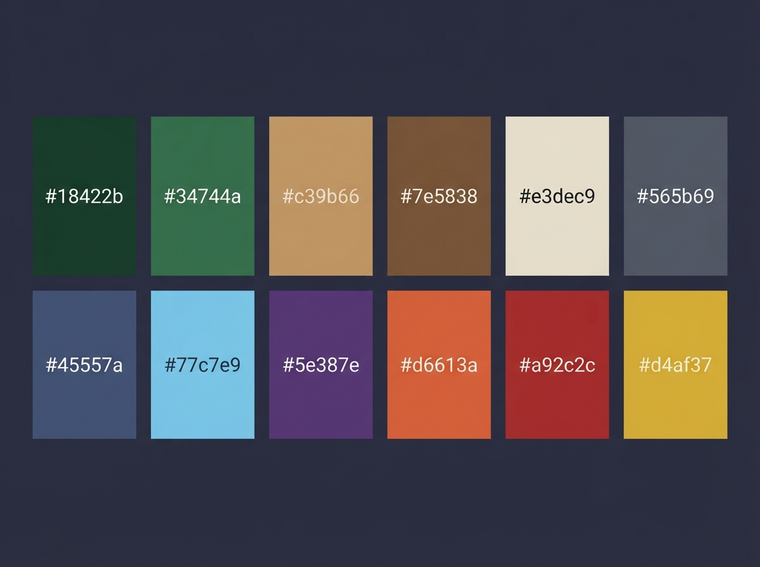
A ramp is three or four steps from shadow to highlight, one family per material. Skin has a ramp. Cloth has a ramp. Leather, steel, wood, stone each have a ramp. This is the approach that makes a sprite read at small sizes, and it is the one to reach for when a single palette is not enough but you still want the cast to look like one cast.
The arithmetic is friendly. Six material families at four steps each is 24 colours plus one reserved transparent index. That sits comfortably under the point where a sheet starts to look noisy, and it gives you real tonal range on each material instead of one flat tone.
Why ramps beat a flat set at small sizes: a 16×16 face gives you maybe 6×6 pixels of cheek. You have room for three tones on that cheek, not twelve. Consistent ramp structure means the eye reads form from tone, and the same tone pattern appears on every character, so the player's eye learns the vocabulary.
A workable ramp looks like this:
Step | Value | Hue shift | Saturation | Use |
|---|---|---|---|---|
Base | reference | none | none | main mass |
Shadow | −25% to −35% | +8° toward blue/violet | +5% to +10% | planes facing away from the key light |
Deep shadow (optional) | ~−50% | +12° | +10% | contact with ground, under overhangs, inside a hood |
Highlight | +18% to +25% | −8° toward yellow/orange | −5% to −10% | planes facing the key light |
The hue shift matters more than the value shift. A shadow that is just a darker version of the base looks like dirt. A shadow that is darker and cooler looks like a shadow, because that is roughly what happens to light in a real scene. Same for highlights going warm.
Failure mode: ramp creep. You start with six families, then add a seventh for "old leather", then an eighth for "wet leather". At that point you have a free palette with a filing system, and the filing system is only in your head. A useful cap is eight families. If you need a ninth, one of the first eight is probably not pulling its weight.

Approach Three: A Per-Sprite Free Palette
Every sprite picks its own colours. Maximum control, and the fastest way to make a set of sprites look like they were drawn by different people.
Free palettes are genuinely correct for some jobs: a single hero sprite you will look at for hundreds of hours, a 64×64 portrait, a title screen, a one-off boss that is supposed to feel alien to everything else. The problem is scope. The approach does not degrade gracefully.
Do the arithmetic. Twenty-four sprites at roughly twelve unique colours each is around 288 unique colours across the sheet. Two sprites drawn a week apart will pick blues that are close but not equal. Close-but-not-equal reads as a mistake, not as a style. The player cannot articulate it, but a cast with drift looks unfinished in a way that a cast with a small palette does not.
Failure mode: accidental accent colours. Free palettes invent signals nobody intended. Somewhere in your sprite set a saturated magenta appears on exactly one enemy because it looked good at the time. Players will read that magenta as a warning, a rarity tier, or a faction. It is none of those. Now you either build a mechanic around a colour you picked by accident, or you redraw the sprite.
A controlled version that works. Free palette for the hero, then lock it. Once the hero sprite is final, extract its colours, deduplicate them, and treat the result as your project palette for everything else. You keep the control where it mattered and you inherit the constraint for free.
The Ramp Rule in Practice
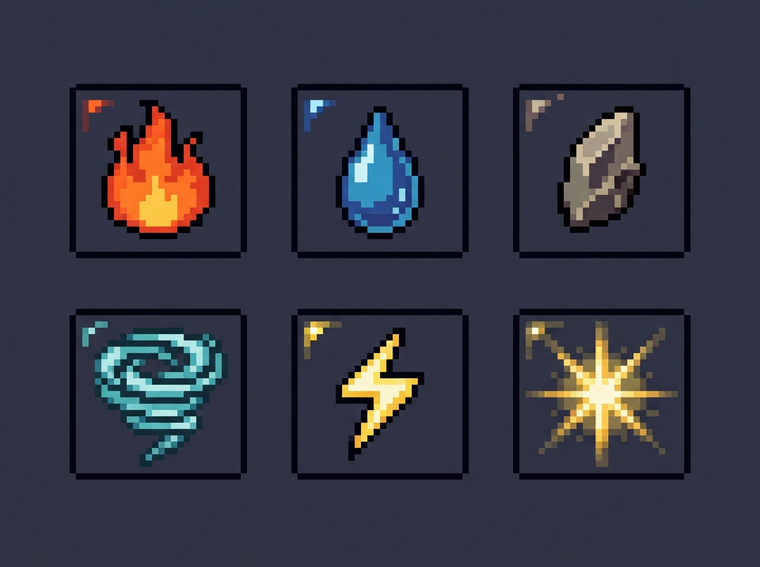
The rule, stated plainly: each material has a base, a shadow at lower value, and a highlight at higher value, and never two highlights on the same layer.
"Layer" is the part people skip. A layer is a group of surfaces facing roughly the same direction. On a knight's helmet, the dome is one layer and the cheek plate is another. If both get the brightest step, the helmet flattens into a single shape, because the two brightest pixels in the region are adjacent and the eye reads them as one plane.
The workflow that avoids it:
- Draw the silhouette first, flat, in the base colour. No ramp at all.
- Mark the light direction with two or three strokes of the highlight on the planes that face it.
- Fill the highlight planes with the highlight step. If two adjacent planes both have it, merge them or darken one.
- Add shadow to planes facing away, including the underside of anything that overhangs.
- Only then consider a deep shadow step, and only for contact points and interiors.
If you cannot point at the light source with one finger after looking at the sprite for two seconds, you have two highlights. That is the whole diagnostic. Squinting at the sprite until it goes blurry works too, because it removes the colour and leaves only the value pattern.
Dithering is the tool for this section as well. A 50% checkerboard between the base and the shadow gives you a fifth step without a fifth colour. On flat pixel art it reads as texture rather than as a gradient, which is usually what you want anyway. Reserve it for large flat areas, though; dithering on a 3-pixel-wide arm is just noise.
The Trap: Adding a Colour to Fix a Silhouette Problem
This is the most common wrong fix in pixel art, and it is worth naming.
The sprite does not read. You cannot tell it is a knight at 1×. You add a saturated accent colour — a bright plume, a glowing visor, a coloured cloak edge. The sprite still does not read. Now you have an unreadable sprite with a bright hat, and one more colour in the sheet.
The test that catches this before you spend the time: fill every pixel with black. Same canvas, same scale, no colour at all. Can you identify it? Can you tell which way it is facing? Can you tell where the arms end and the torso begins?
If the answer is no, the problem is the silhouette. The fixes are structural: introduce 1–2 pixels of negative space between the arm and the torso so they separate; change the outline thickness on one side; exaggerate the pose; make the helmet a different width from the shoulders. None of those are colour decisions. Colour is the last 20% of readability, and it does not fix the first 80%.
Fill it black and look at it at 1×, not at 800%. Every sprite looks like it reads at 800%. That is the zoom level where you have been lying to yourself for an hour.
There is a second version of the same trap, inside a ramp. The leather ramp has no good dark, so you add a purple to it. That purple now exists on exactly one sprite, appears nowhere else in the project, and reads as an intentional signal because everything around it is systematic. If a ramp needs a colour it does not have, the answer is either to shift the whole ramp's hue, or to accept the flat look and fix readability with shape. Adding a colour changes your system.
Pixel Art Palettes Three Approaches, Compared in One Table
Fixed palette | Indexed ramp per material | Per-sprite free palette | |
|---|---|---|---|
Colour decisions per sprite | none | 3–4 per material family | every pixel |
Typical total colours | 4–54 depending on the source set | roughly 24–48, eight families max | grows with sprite count |
Coherence across a cast | highest | high, if the ramp families are shared | low |
Reads at 16×16 | depends entirely on the fixed set | yes, by construction | varies sprite to sprite |
Repaint cost later | one palette file | one ramp per material | every sprite |
Best for | whole projects, multi-artist teams, hardware-era looks | characters with distinct materials, 24–64 px sprites | hero sprites, portraits, title art, one-off bosses |
Primary failure mode | a material with no match; then palette creep | ramp creep; double highlights on one layer | the cast stops looking like one cast |
How to Choose: Sort by Scope, Not by Taste
The practical decision procedure, in order:
One artist, under about 40 sprites. Start fixed. Pick 16 colours. Draw the first ten sprites with no exceptions. Then promote the three or four materials that genuinely need tonal range to ramps, and keep the rest flat. Hybrids are normal and they are not a compromise; they are the state most shipped projects end up in.
More than one artist. Fixed palette, no discussion. The alternative is a review pass on every sprite, and review passes do not scale.
A single hero or a portrait. Free palette is fine. Lock it when it is done and extract the palette for everything else.
A cast of characters that must be told apart in play. Ramps, and make the ramp families carry the information. If enemies share three ramp families and allies share three different ones, players learn the vocabulary without a tutorial. That is a gameplay feature you got for free by being systematic about colour.
Any project where you are generating sprites. Agent Sprite Forge will hand you a sprite sheet, and that sheet arrives with its own colour choices. If you import it and move on, you have adopted a free palette whether you wanted one or not. Reindex the output to your palette first, then hand-fix the ramps. The generation saves you the shape work; it should not get a vote on the colour system.
One more engine-level detail: check that texture filtering is nearest-neighbour for every sprite material. Bilinear filtering on a 32×32 source turns your carefully chosen ramp into a soft gradient and undoes the whole exercise. Set the import size to match the source exactly, and scale with integer factors only. A 32×32 sprite scaled by 3 is fine. Scaled by 2.5 is not.
The Shared-Palette Argument
A cast drawn from one palette looks intentional even when the sprites are rough.
That is the argument, and it survives contact with real projects. Roughness that is consistent reads as style — the eye groups it, decides it is a decision, and stops noticing. Roughness that is inconsistent reads as a mistake, because the eye finds the one sprite that does not match and keeps returning to it. You get more credit for a coherent set of mediocre sprites than for one excellent sprite surrounded by eleven that were drawn in different moods.
There is a second benefit that only shows up during production. A shared palette makes the project editable. When you decide the whole game needs to be colder, you shift the base hue of every ramp by a few degrees and the entire cast follows. When you need a night variant of a scene, you remap the palette. When a new artist joins and draws an enemy, their sprite lands in the set and matches, because the constraint did the matching for them.
And a third, which matters if the project runs long: a shared palette is the cheapest thing to reconstruct from memory. Six months from now, when you open the file and cannot remember why anything looks the way it does, a fixed base and a handful of ramps will tell you what to do with the next sprite. A free palette will not. It will just be a pile of colours that happen to be in a folder, and you will be making the same decision again from zero.
That is the case for being systematic. Not because any one of the three approaches is correct, but because the cost of changing your mind goes up the longer you leave it. Fixed palettes are easy to loosen. Free palettes are expensive to tighten.
Keep going
- the pixel art maker
- the pixel art size guide
- the AI pixel art generator
- the pixel art tool index
- the Piskel alternative
- the sprite resource library
Build the world it walks in
A character, a tile or a model is a material with nowhere to stand. Every world on the 3D game builder was made from one written description and published as a page you can play — including Mini World and The Cyclops' Island.