Pixel Art Sizes Explained: 16x16, 32x32, 64x64 & 128x128 (Free Guide)
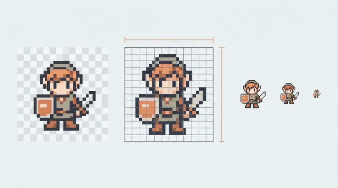
Make your own 16 by 16 pixel art
Which pixel art size should you use? 16x16, 32x32, 64x64 and 128x128 explained — the colour budget each one implies, what each is for, and a free generator for each. Plus the Minecraft and spreadsheet grid families.
16 by 16 pixel art is a grid of 256 cells: 16 columns, 16 rows, one colour per cell. That number is the design brief. Every mark you place is a subtraction from a fixed budget, and the budget is set before you draw anything.
Size decides detail before you draw a pixel. A 16x16 grid cannot hold a readable face. A 64x64 grid cannot hold a crowd. This guide covers the four sizes that account for most game, icon and wallpaper work - 16x16, 32x32, 64x64 and 128x128 - with the cell count, the typical use, the failure mode and the colour budget for each. It also covers the two grid families people usually mean when they say "pixel art grid": Minecraft block builds, where the unit is a block rather than a pixel, and spreadsheets, where the unit is a cell.
Quick Answer: Size = Detail Budget
A grid size is a limit on how many distinct marks you get. 16x16 gives you 256 cells. 32x32 gives you 1,024. 64x64 gives you 4,096. 128x128 gives you 16,384. That is the whole budget, and it is spent by the time you have blocked in a silhouette.
The consequence is that detail is not something you add at the end, it is something the grid permits from the start. An eye costs 2 to 6 cells at 16x16. The same eye at 64x64 can afford a lid line, an iris, a pupil and a single specular highlight - 20 to 40 cells. Same feature, different cost, because the grid changed the denominator.
Fill competes with everything else. A character body at 16x16 eats 60 to 120 cells of solid colour. That leaves roughly 130 cells for outline, face, hands, a held item and any interior shading. Three separate internal shapes will not survive that. Two will, if they touch.
| Grid | Cells | Typical use | What it cannot hold |
|---|---|---|---|
| 8x8 | 64 | Inventory cursors, status dots, favicons | Any face; more than one silhouette |
| 16x16 | 256 | Characters, items, tiles in dense tile sets | A face with readable eyes and mouth; text |
| 32x32 | 1,024 | Game sprites, enemies, NPCs, projectiles | Facial expression; anything longer than 3 characters of text |
| 64x64 | 4,096 | Icons, portraits, dialogue and shop art | A full scene; two subjects at equal weight |
| 128x128 | 16,384 | Wallpapers, scene art, title screens | A single subject that still reads at thumbnail size |
16x16: Characters & Items
At 256 cells, 16x16 pixel art is the smallest size that still reads as a character rather than a symbol. The constraint is silhouette. If the outer contour is not identifiable on its own, nothing you do inside the grid will fix it, because there is no interior room to explain what the shape is.
The working method is to draw the whole thing in one flat colour first, then read the contour. If a chest plate and an arm merge into one lump, the pose is wrong, not the palette. Fix it in the solid pass where a change costs you eight cells instead of a full redraw.
16x16 also pairs naturally with tiles. A tile set repeats, so the eye stops inspecting individual cells and starts reading pattern and rhythm. That is the one situation where a grid this small is not a compromise.
What 16 by 16 pixel art is good at
One object, one pose, one idea per grid: a sword, a potion, a coin, a barrel, a slime, a signpost, a wall tile, an inventory slot. Flat items with a strong outline and one accent colour are the sweet spot. A shield works because the shape is a single rounded plate; the moment you add a strap, a boss and a rim as three separate interior shapes, it stops reading.
Where 16 by 16 pixel art breaks
Faces and text. An eye plus a mouth is 2 to 4 cells before any shading, and at that size a mouth reads as a stray pixel rather than an expression. Anything with two internal shapes that do not touch - a potion with a glass line and a liquid line - collapses into a blob. Text below about 5 cells tall is unreadable; use a separate UI font instead of drawing letters into the grid.
32x32: Game Sprites
32x32 is 1,024 cells, and it is the size most 2D game sprites are drawn at because it holds a readable pose without demanding a portrait. You can separate the head from the torso, put a weapon in a hand, show which leg is forward, and still have cells left for a two-tone shadow on the body.
The colour count that pairs with it: 12 to 16 colours total, and that includes the outline. A workable split is one outline colour, three or four ramps of three steps each (base, shadow, highlight), one or two accents, and transparent. Two-tone shadow means a body colour appears at least twice - once lit, once shaded. If every colour in the palette appears exactly once, you have drawn noise, not form.
The mistake: when a 32x32 sprite looks wrong, most people add a colour. That fixes nothing, because the fault is almost always the silhouette - a limb that does not separate from the torso, or a head exactly as wide as the shoulders. Redraw the outline in solid black and look at it. If the black shape is not identifiable, no palette will rescue it.
- Canvas32x32, viewed at 4x or 8x nearest-neighbour zoom while you draw. Never work at 1x; you will place single cells by accident.
- Palette12 to 16 entries including outline and transparent. Three-step ramps are easier to keep consistent than smooth gradients.
- OutlineOne pixel, dark but rarely pure black. A dark version of the body hue keeps the sprite from looking cut out.
- ShadowOne extra step per material, placed on the side away from the light, not wrapped around the whole shape.
64x64: Icons & Portraits
64x64 is 4,096 cells, and it is the first size on this list where a face is a face rather than a symbol. An eye now gets 8 to 20 cells: an eye white, an iris, a pupil, a lid line and one specular highlight. That highlight is the reason 64x64 portraits work and 32x32 portraits do not - at 32x32 there is no cell to spare for it.
What changes at this size is which part of the drawing carries the read. At 16x16 the outline carries it. At 64x64 the shading carries it. You are drawing form now, so you need ramps: 3 to 5 steps per material, and each material stays on its own ramp. Skin lit by the same lamp as steel will only look consistent if the steel ramp has higher contrast than the skin ramp. Metal reads as metal because of the value jump, not because of the hue.
Where it breaks: crowds. 64x64 is one subject. Two figures sharing the grid get roughly 2,000 cells each, which is back to 32x32 problems with worse composition. Keep 64x64 to a single subject and spend the leftover cells on background at deliberately low contrast, so the subject separates by value rather than by colour.
128x128: Wallpapers & Scenes
128x128 is 16,384 cells. At this size a single sprite stops being the subject and becomes one object in a composition. A character filling a third of the canvas is roughly 42x128 - about 5,300 cells - and everything else in the grid is environment: ground, sky, architecture, props.
The counter-intuitive part is that a large grid needs fewer colours per object, not more. At 16x16 you might spend 12 colours on one character because all 12 are doing structural work. At 128x128, six objects at 12 colours each is 72 colours competing, and the eye cannot tell what is foreground. Scene work at this size typically keeps each object on a 4 to 6 colour ramp and separates objects by value band - dark foreground, mid ground, light sky - rather than by hue.
Mechanical settings matter more here than at small sizes. Draw at 1x and zoom to 2x or 3x, never a smooth zoom. When you export for a wallpaper, upscale by whole numbers only - 2x, 3x, 4x. A 2.5x upscale produces pixels of uneven width and the grid stops looking deliberate.
Colour Count Per Size
The rule that surprises people: as the grid grows, the palette usually shrinks per element. Small grids force reuse - one colour serving as outline, shadow and hair - and that reuse is exactly what makes 16x16 art look coherent. Large grids tempt you into a unique colour for every surface, and the result reads as a photograph with the resolution turned down.
The number that matters is not total palette size, it is colours per element. A 32x32 sprite with 16 palette entries across 4 elements is coherent. A 128x128 scene with 24 entries total can look rich if those entries are assigned by value - dark, mid, light - and reused across objects.
The mechanical reason is that pixel art reads by adjacent contrast. Two neighbouring cells that differ in value create an edge. Two neighbouring cells that differ in hue but match in value create mush. Adding a colour without adding value contrast spends a palette slot and buys no readable form, which is why "it looks flat" is usually a value problem, not a hue problem.
| Grid | Colours per element | Sensible total | If you exceed it |
|---|---|---|---|
| 16x16 | 3 to 5 | 8 to 12 | Every cell is a different colour and the silhouette disappears; at 1x it reads as noise. |
| 32x32 | 4 to 6 | 12 to 16 | The extra colours land in the outline and the shadow goes flat; the sprite looks like a sticker. |
| 64x64 | 4 to 8 | 16 to 32 | Skin and metal turn waxy, and unevenly spaced ramp steps show as visible banding. |
| 128x128 | 3 to 6 | 24 to 48 | Objects stop separating by value and the whole scene flattens into one plane. |
Minecraft Pixel Art & Grids
Minecraft pixel art is measured in blocks, not pixels. One block is one cell of the image. A 16x16 sprite becomes a 16x16 block wall: 256 blocks, which is a build you can finish in an evening. The same sprite at 64x64 is 4,096 blocks, which is a different kind of project with a different kind of commitment.
The mapping matters because a block is not a pixel. A pixel is a flat colour you choose. A block is a flat colour with texture and lighting baked in - wool and concrete at the same nominal colour do not read the same at distance, and busy block textures add noise that a pixel would never have. This is why a photo needs a higher block count than a drawing does: a photo carries gradients, and gradient costs cells. At 32x32 a face turns to mud in blocks; at 64x64 or 128x128 the shapes survive the texture noise.
Build grid versus art grid is a separate distinction. An art grid is flat by definition: one cell, one colour, no depth. A build grid is three-dimensional - you can place blocks at any height, and the grid only appears where you look at a flat plane. That creates a decision a raster editor never asks: what goes behind the image. A background wall in a low-saturation block makes the subject read; leaving the image floating so terrain shows through the gaps reads as damage.
01
Downscale the source image to the block count you will actually place - 32x32, 64x64 or 128x128 - before you touch the world.
02
Reduce the image to colours that exist as full blocks in the version you play, and posterise to that set first rather than picking blocks cell by cell.
03
Check the result at the distance a player will view it from, not at nose length. Two blocks back from the screen is the honest test.
04
Build top-down against a scaffold line so rows stay aligned; a one-block drift at row 3 is invisible until row 30.
05
Decide the backing wall before you start. Retro-fitting a background behind a finished build is slower than building it in.
Spreadsheet & Google Sheets Pixel Art
In a spreadsheet, one cell is one pixel. The grid is whatever the sheet allows and whatever you are willing to scroll. A 32x32 image is 1,024 cells. A 64x64 image is 4,096. A 128x128 image is 16,384 cells - displayable, but tedious to enter by hand.
Conditional formatting is the palette. You write rules that paint a cell based on its value, then type a letter or number into each cell to select a colour. The alternative is manual fill, which is simpler to set up but leaves you with no way to recolour the whole piece by editing one rule. If you intend to revise the art, use rules. If it is a one-off, fills are faster.
The spreadsheet route is genuinely the right tool in two cases. Collaboration: sheets share natively, several people can edit at once, and there is a change history - better than mailing a PNG back and forth. Data-driven grids: a cell colour can be computed from a formula, so the piece can react to a number, which no raster editor does. It is the wrong tool for animation. A sheet has no frames, no onion skin and no timeline. Animating in a sheet means duplicating the grid and swapping ranges, and after about two frames that is slower than any dedicated editor.
Free Tools for Each Size
Pick by what you already have, not by feature list. If you have a photo and need a starting silhouette, use the converter. If you have a blank page and a fixed size, use the maker. If you have no idea what to draw, use the generator. All of them produce a grid you can keep editing elsewhere.
Each tool has its own page; this section is only the routing.
- Pixel art converterTakes an image down to 16x16, 32x32, 64x64 or 128x128 and quantises it to a fixed palette. Use it for a first silhouette, then redraw - converted output is a starting point, not a finished sprite.
- Pixel art makerA grid editor with a real palette, onion skin for animation frames, and PNG export at integer scale. Use it for anything you intend to animate or hand-tune.
- Pixel art generatorDescribe the object in words and get a grid back. Strongest at 16x16 and 32x32 items, where the silhouette is the entire job.
- Agent Sprite ForgeOur sprite pipeline. It takes a written description and returns sprite sheets at a chosen grid size, which is what feeds the 3D side of the builder.
See a 16x16 World in 3D
A 16x16 tile is 256 cells, and in a 3D world it becomes a texture. Textures at that size stay sharp only if you filter them correctly. In Three.js terms: set the texture's magFilter and minFilter to NearestFilter and turn mipmaps off for objects you want crisp close up; keep mipmaps on for distant terrain, or the ground grid shimmers as the camera moves. That is the trade at the small end of the range - nearest filtering keeps pixels readable at two metres and aliases at fifty.
The Cyclops' Island runs almost entirely on small-grid tiles: trees, rocks, shoreline, props and items, each drawn at 16x16 or 32x32 and reused across the scene. Mini World uses the same approach with a smaller footprint per object. Sprites come out of Agent Sprite Forge, get packed into an atlas, and are placed as objects by the 3D game builder, which is where a written description turns into a playable layout.
The payoff is arithmetic, not aesthetics. At 16x16 you lose the ability to draw a specific face, and you gain a tile you can afford to repeat. 256 cells times a few dozen tiles is a place. 16,384 cells times a few dozen tiles is a project nobody finishes. When you look at the scene below, look at the ground and the props rather than the sky - the ground is where the grid is visible.
Walk into the world it belongs to
A sprite is a character with nowhere to stand. The last step is the one nobody else offers: take the sheet you just built and put it in a world someone can walk around in — a small island, a planet, a rainy street corner. Every world on this site was made from one written description and published as a page you can play.
FAQ
What size should I start with? +
16x16. A mistake takes two minutes to redraw, and 256 cells are still enough to finish something recognisable. Once a readable sword at 16x16 is routine, 32x32 stops feeling tight.
Is 16x16 too small? +
Only when the idea needs a face, text, or two internal shapes inside one object. For items, tiles, cursors and inventory art it is a standard working size. If you need an expression, move to 64x64 rather than fighting 256 cells.
What is the best size for a character? +
32x32 for characters you animate in game - enough cells for a readable pose and a two-tone shadow. 64x64 for portraits and dialogue art. 16x16 works for characters that read as silhouettes, such as a slime or a top-down knight.
What is the best size for an icon? +
32x32 for interface icons, since that size survives being shown at 1x in a toolbar or list. 64x64 when the icon is the artwork, such as a store tile. 16x16 for favicons and cursors.
How many colours should I use? +
Count per element, not per image: 3 to 5 per object at 16x16 and 32x32, 4 to 8 at 64x64, and 3 to 6 at 128x128 where several objects share the canvas. Include the outline in that number and reserve one entry for transparent.
What is a pixel art grid? +
The cell structure you draw into - 16 columns by 16 rows, or 32 by 32. Every mark snaps to a cell and every cell holds exactly one colour. It also sets the export size, which you then scale by whole numbers for display.
How do Minecraft grids differ from pixel art grids? +
One block replaces one pixel, so the unit is a cubic metre of world rather than a flat cell. Blocks have texture and lighting, so a 32x32 image that works in a raster editor often needs 64x64 or more in blocks. A build grid is also three-dimensional; an art grid is flat.
Back to the 3D Game Builder
All 31 finished 3D worlds, games and scenes live on one page — every one of them playable.